Case studies and samples
Our Work
A curated gallery of printing, branding, custom items, and web projects.
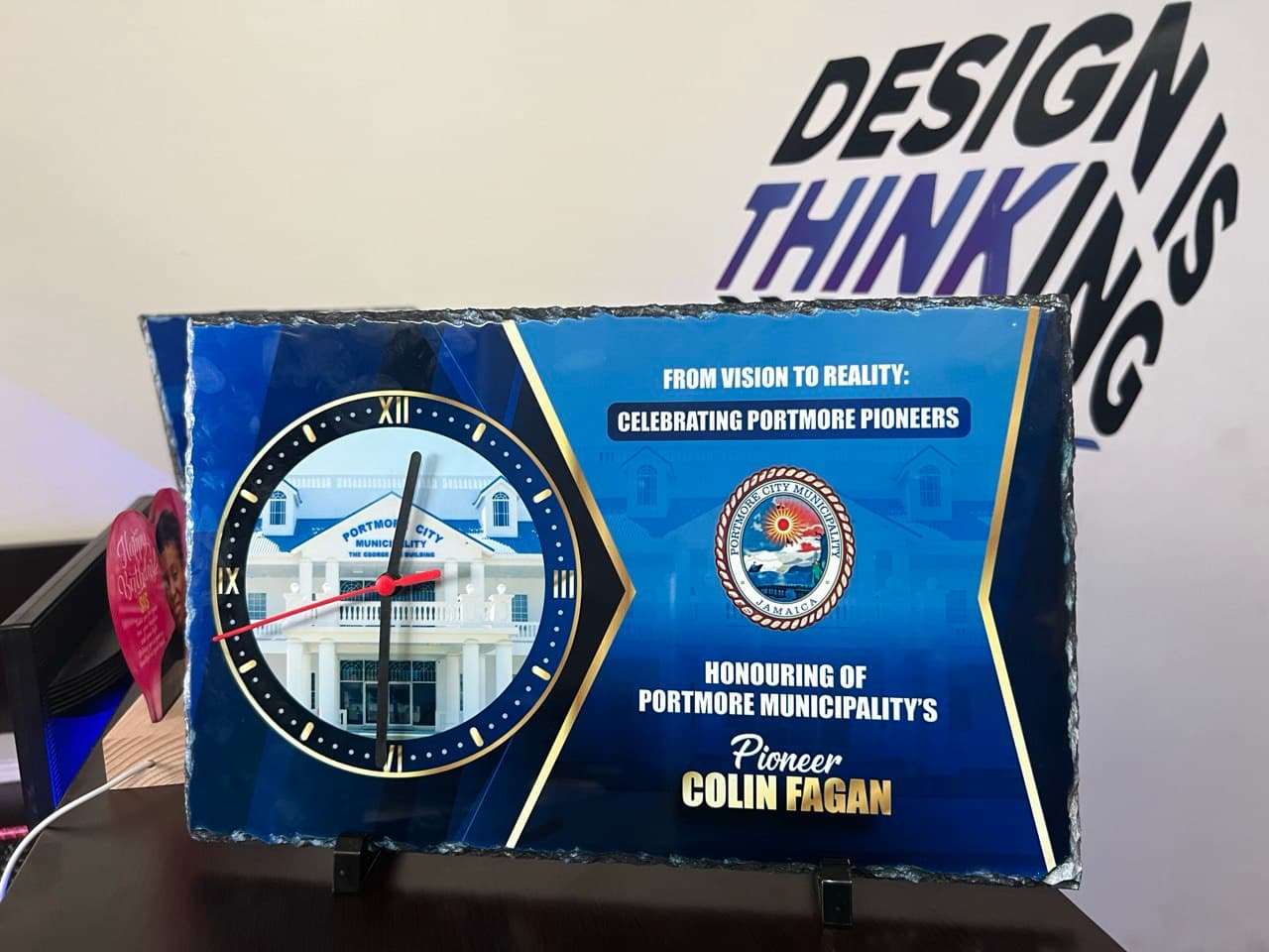
Corporate Recognition Rock Slate Clock
Portmore Municipal Corporation
>
Custom-designed corporate recognition clock plaques produced for the Portmore Municipal Corporation to honor municipal pioneers and key contributors. Each piece combines premium print quality, precise finishing, and functional design, creating a lasting keepsake suitable for official ceremonies, awards, and executive gifting. Designed and produced in bulk with consistent branding and professional presentation.
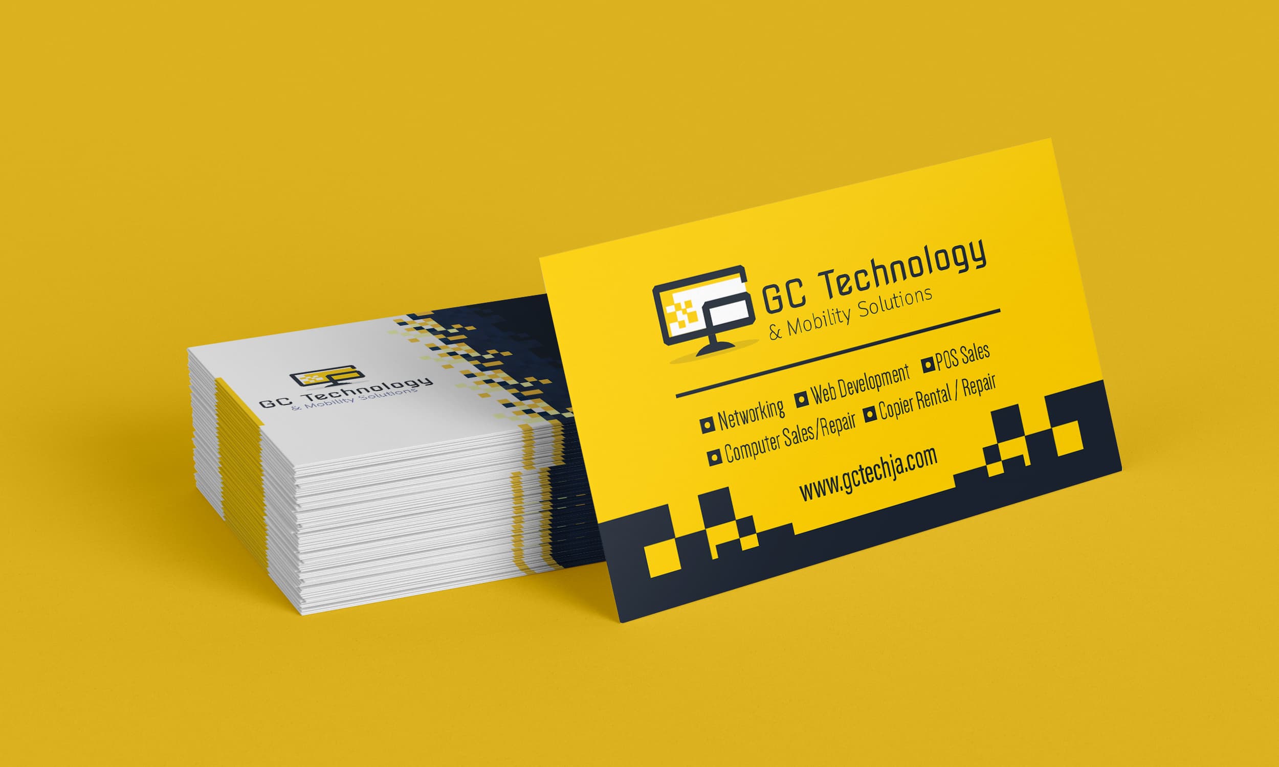
GC Technologies Business Card
GC Technologies
>
This project focused on creating a modern, professional business card for GC Technologies that reflects innovation, reliability, and technical expertise. The design uses a bold yellow and black color palette to ensure strong brand recognition, paired with clean typography and structured spacing for clarity and readability.
The layout was carefully designed to balance visual impact with practicality, making it suitable for everyday networking while standing out in competitive business environments. Print-ready specifications were applied to ensure consistent quality across both small-batch and bulk production, with a format that also adapts well for digital sharing and online presentation.
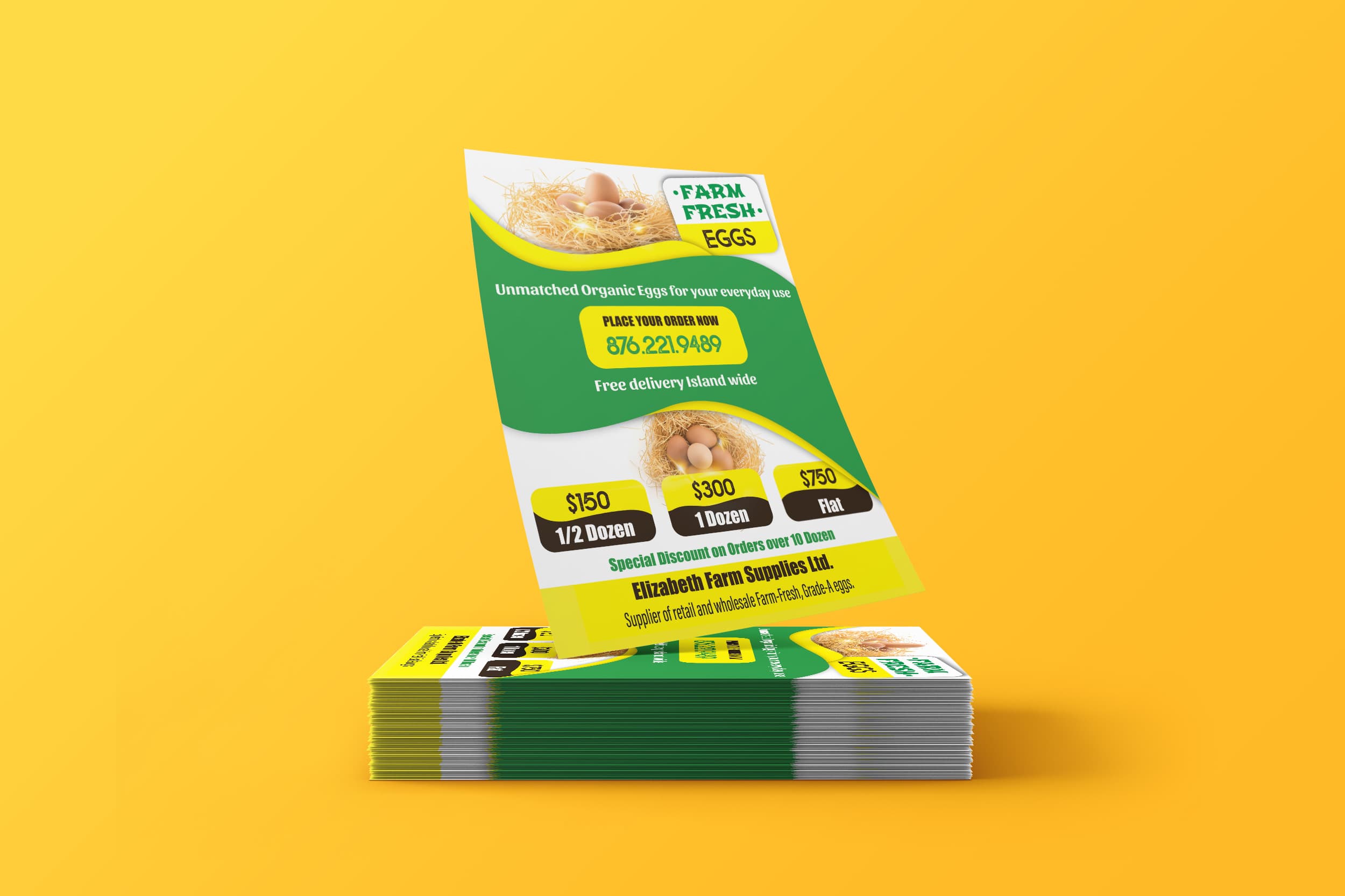
Farm Fresh Eggs Promotional Flyer
Elizabeth's Egg Farm
>
This project involved designing a bold, eye-catching promotional flyer for a local farm egg supplier, focused on clarity, affordability, and quick customer action.
The design uses vibrant green and yellow tones to communicate freshness and trust, paired with high-quality product imagery to immediately showcase the eggs. Clear pricing tiers were laid out for half dozen, dozen, and flat purchases, making it easy for customers to understand options at a glance. A strong call-to-action and contact number were prominently featured to drive fast orders, while supporting copy highlighted islandwide delivery and bulk order discounts.
This piece was designed for both digital sharing and print distribution, ensuring high visibility and consistent brand presentation across platforms.
Deliverables
Promotional flyer design
Print-ready layout
Social media–friendly format
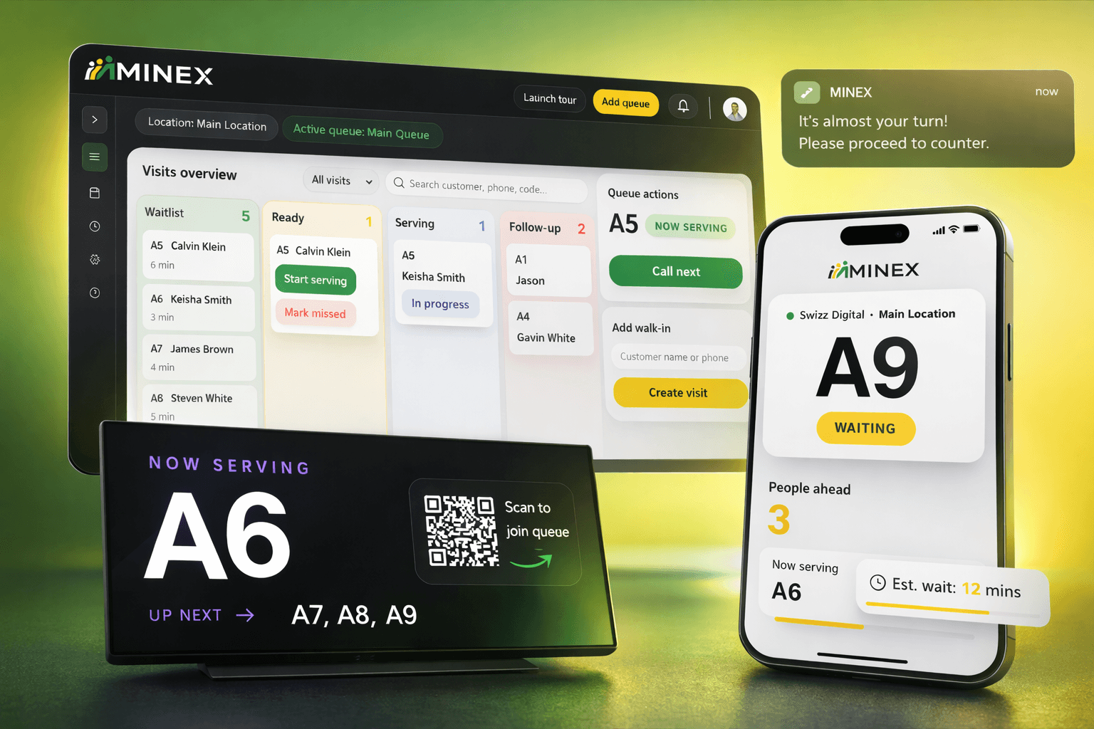
Minex
Minex
>
Minex is a custom-built queue management and appointment scheduling platform developed by Swizz Digital. It enables businesses to manage customer flow more efficiently by allowing clients to join queues remotely, book appointments, and receive real-time updates.
The system includes a clean staff dashboard for managing queues, a customer-facing interface for seamless booking, and digital display screen support for in-location visibility. Designed with scalability in mind, Minex supports multiple locations and provides insights to help businesses optimize operations and improve service delivery.
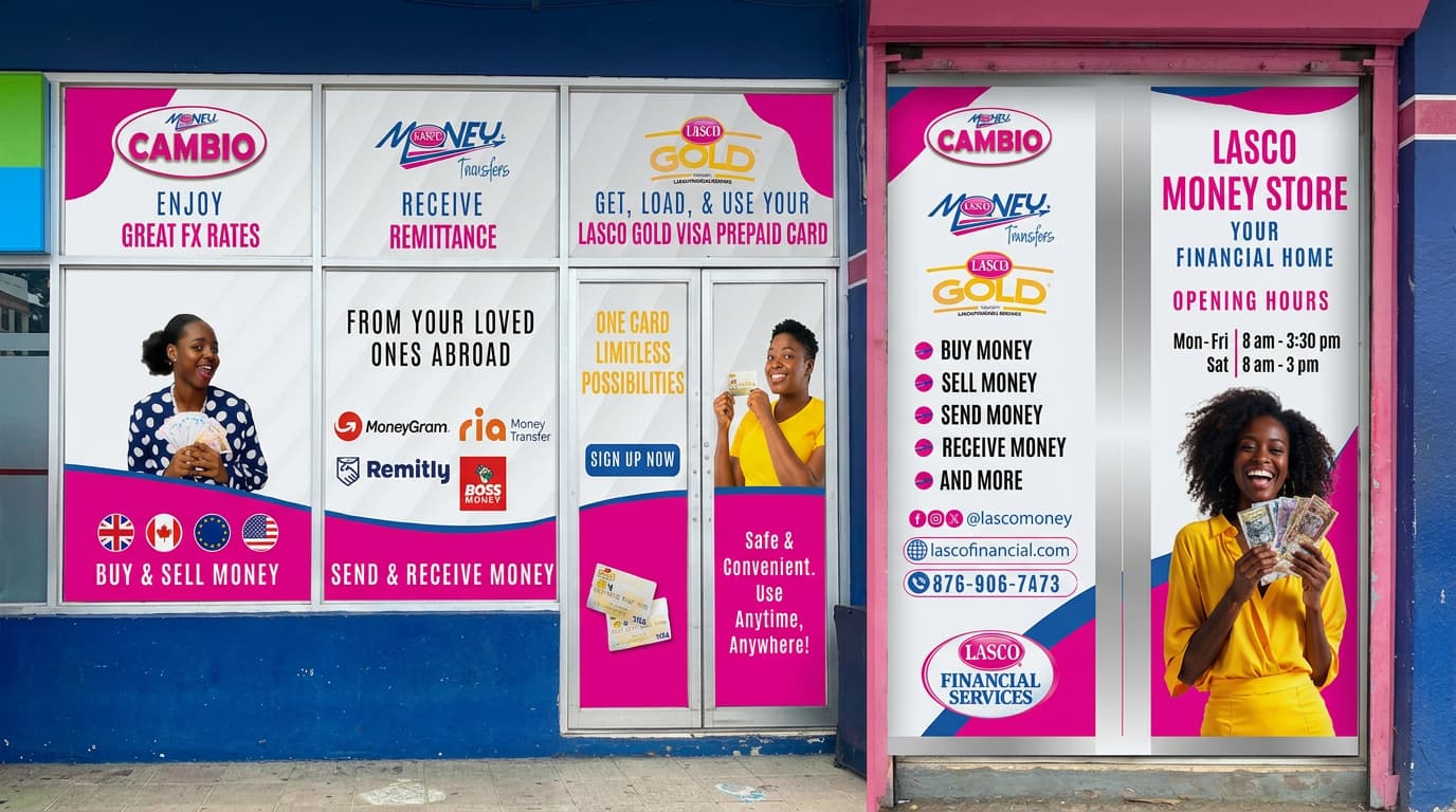
LASCO Money Store Window Branding
LASCO Financial Services
>
The Challenge
LASCO Financial Services needed to transform its Papine storefront into a clear, high-impact visual that communicates multiple services at once. The existing space lacked structure, making it difficult for customers to quickly understand offerings like remittance, currency exchange, and prepaid card services.
The challenge was to unify multiple brands into one cohesive storefront while maintaining clarity, readability, and strong street-level visibility.
The Story
The approach focused on structuring the storefront as a guided visual experience. Each window panel was assigned a clear purpose, enabling customers to scan and understand services from left to right quickly.
Bold typography, high-contrast color blocks, and clean layouts were used to ensure readability from a distance. Brand elements were carefully balanced so that LASCO Gold, Money Transfer, and Cambio could coexist without visual clutter.
Real-life imagery was introduced to make the design more relatable and engaging, while maintaining a clean and modern feel across all panels.
The Solution
The final storefront delivers a bold, organized, and highly visible branding system that doubles as a marketing tool.
-
Clear service segmentation across panels for instant understanding
-
Strong, high-contrast typography for readability at a distance
-
Consistent use of brand colors with magenta as the anchor
-
Integration of all services, logos, and key information in one cohesive layout
-
Seamless large-format print and installation across windows and doors
The result is a storefront that not only looks modern and professional but actively attracts attention and communicates value within seconds.